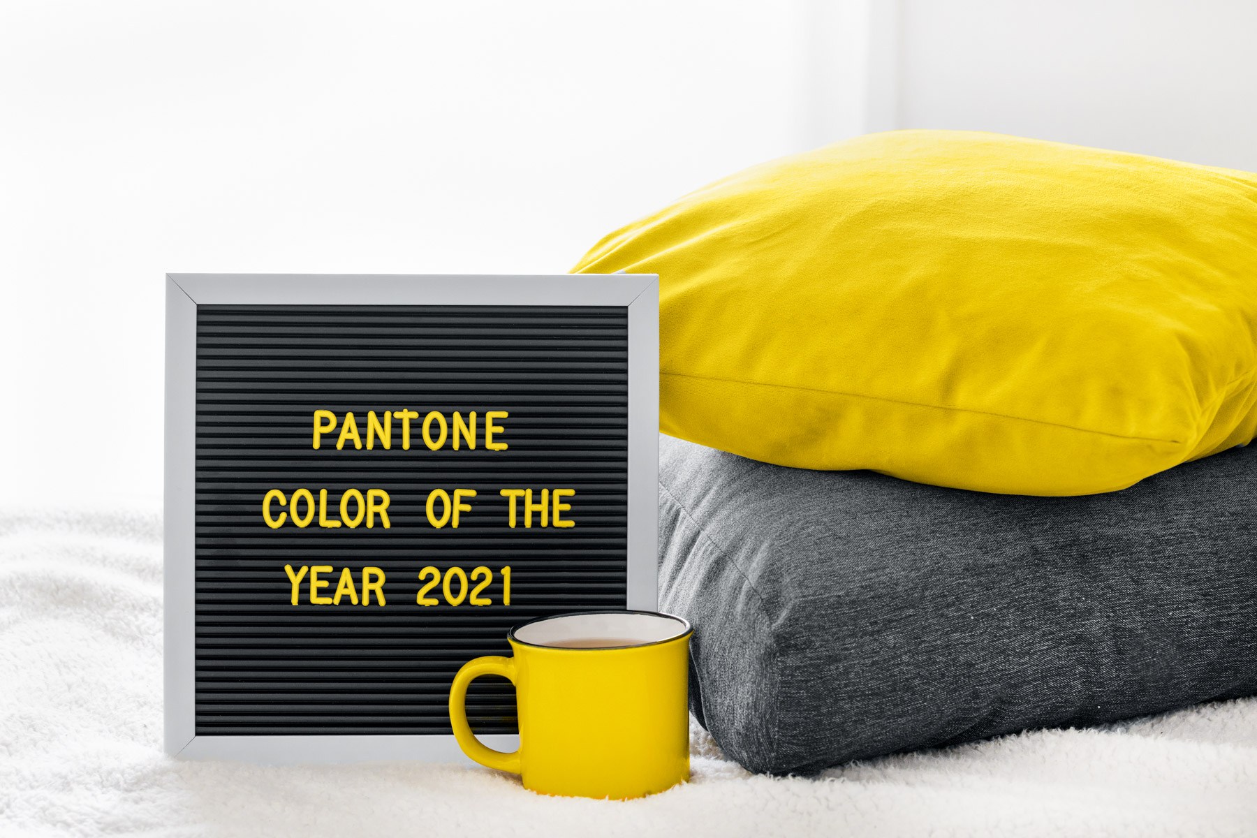
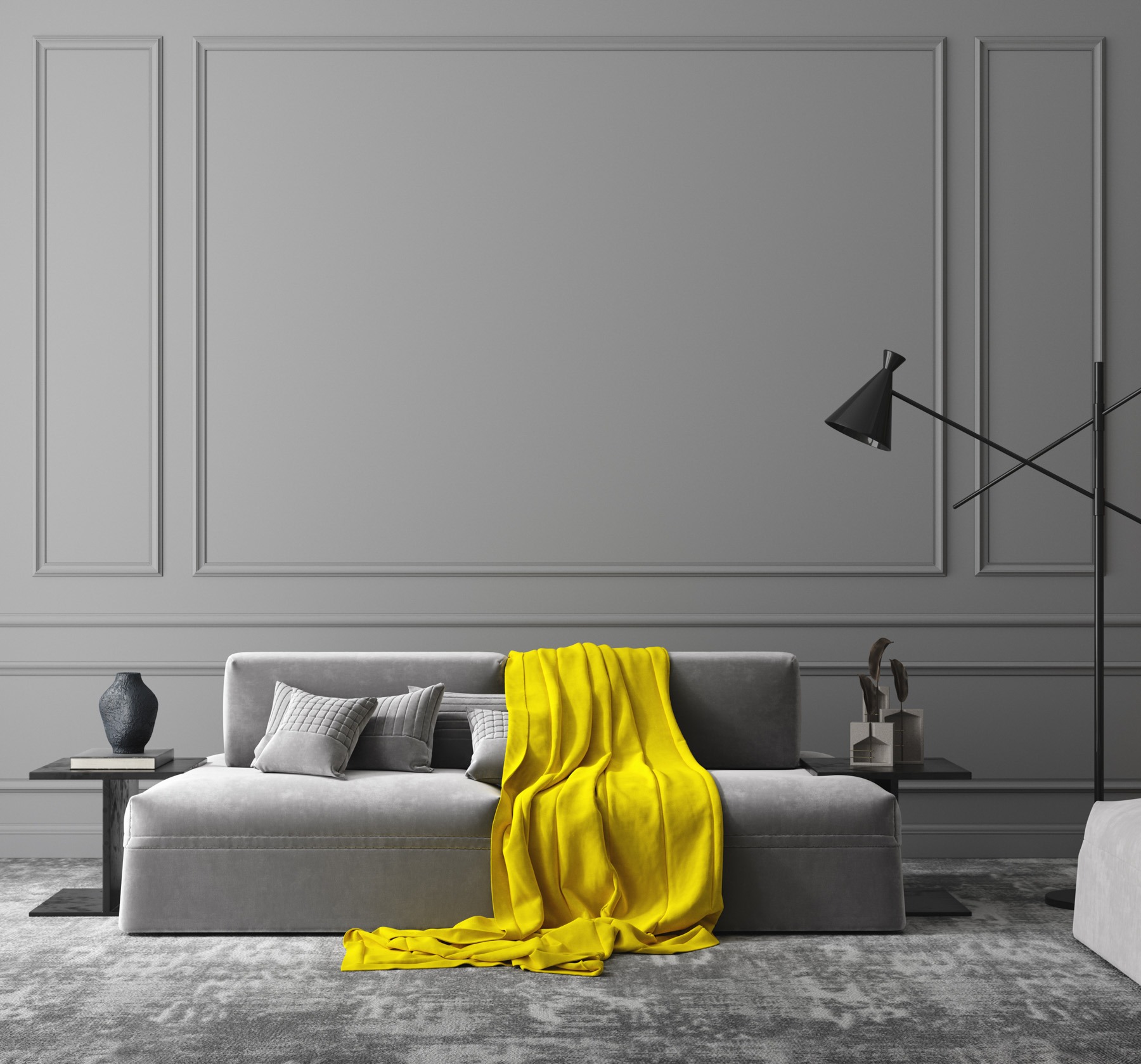
For the second time in the past two decades, Pantone has announced not one, but two, Colours of the Year: dependable and neutral Ultimate Gray, and the sunshine yellow Illuminating.
Many experts are pointing to these choices as the perfect symbolism for the year that was: being thrown into a global pandemic, quarantining at home, not knowing what the future held versus the sunshine that tomorrow will bring.
That’s certainly how the New York Times has described it, writing “the gray of cloudy skies, sidewalk cement, comfortable bed linens, gravity blankets, or low-light screens – the colour evokes out collective experiences over the past year.” However, contrast this against Illuminate – the light at the end of the tunnel, the sun rising high signalling the end of the dark night.
Pretty metaphorical colour choices you made there, Pantone.
According to Pantone, it goes beyond that. Ultimate Gray and Illuminating are “two independent colours that highlight how different elements come together to support one another… practically and rock solid but at the same time warming and optimistic, the union is one of strength and positivity.”
So how can you bring this thoughtfulness and sense of sunshine into your home?
Grab a paintbrush
According to Vogue, the colours complement each other but have the ability and confidence to stand alone as well. Ultimate Gray is a dependable colour that will suit almost every room of the house, so never be afraid to use it on your walls.
Just bear in mind though, that as a whole wall, it can be a tad dark so best to use it as a feature or with some bright, airy and neutral furniture and textile choices. Other ways to introduce Ultimate Gray include structural finishes such as concrete or metallic sheeting.
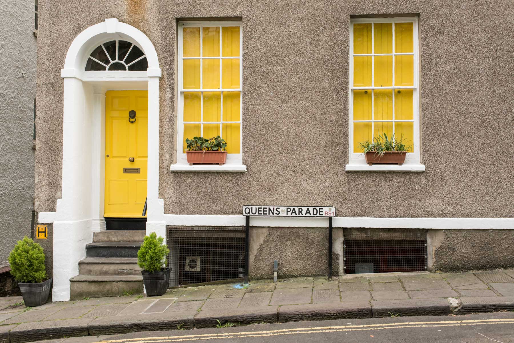
Want to use some Illuminate on your walls? Why not pop it on the front door to create an inviting entrance. Or, use it as a small accent wall. It’s great in a kids’ room, as a skylight feature to emphasise the sunshine streaming in or even the back of some inbuilt shelving to create a bit of a statement.
Decorative pieces
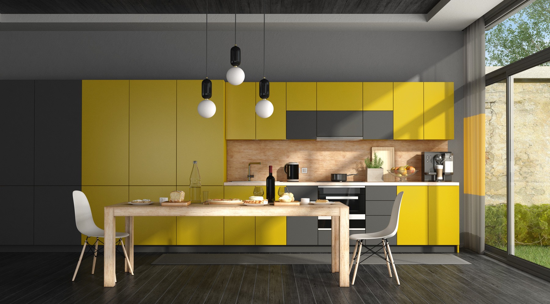
While both colours can be used on the walls, Pantone actually envisages them being used primarily in textiles and decorative accessories. The bold yellow hue can be daunting to use, so furniture items such as bar stools, feature pendant lights or even dining chairs can be a perfect way to incorporate them into your home without committing too much.
Of course, Ultimate Gray does tend to be a bit easier to accept into design if you’re not too fond of bright, bold hues. Again, look at things such as bar stools, chairs or pendant lights. However you can also bring the gray into your larger or fixture furniture choices such as concrete topped dining tables, kitchen cabinetry, flooring or even in the softer furniture items such as couches or arm chairs.
Go softer with textiles
There are some beautiful ways to incorporate both colours into your textiles. Whether it’s bed linen, throws over the couch, rugs, blankets on the bed or pillows, both Ultimate Gray and Illuminating can be gorgeous in almost every room of the house.
Using the colours in your textiles are the perfect way to play with colour trends without making massive commitments. It’s also a good way to ensure you can chop and change things as you please as you’re not making a huge financial commitment.
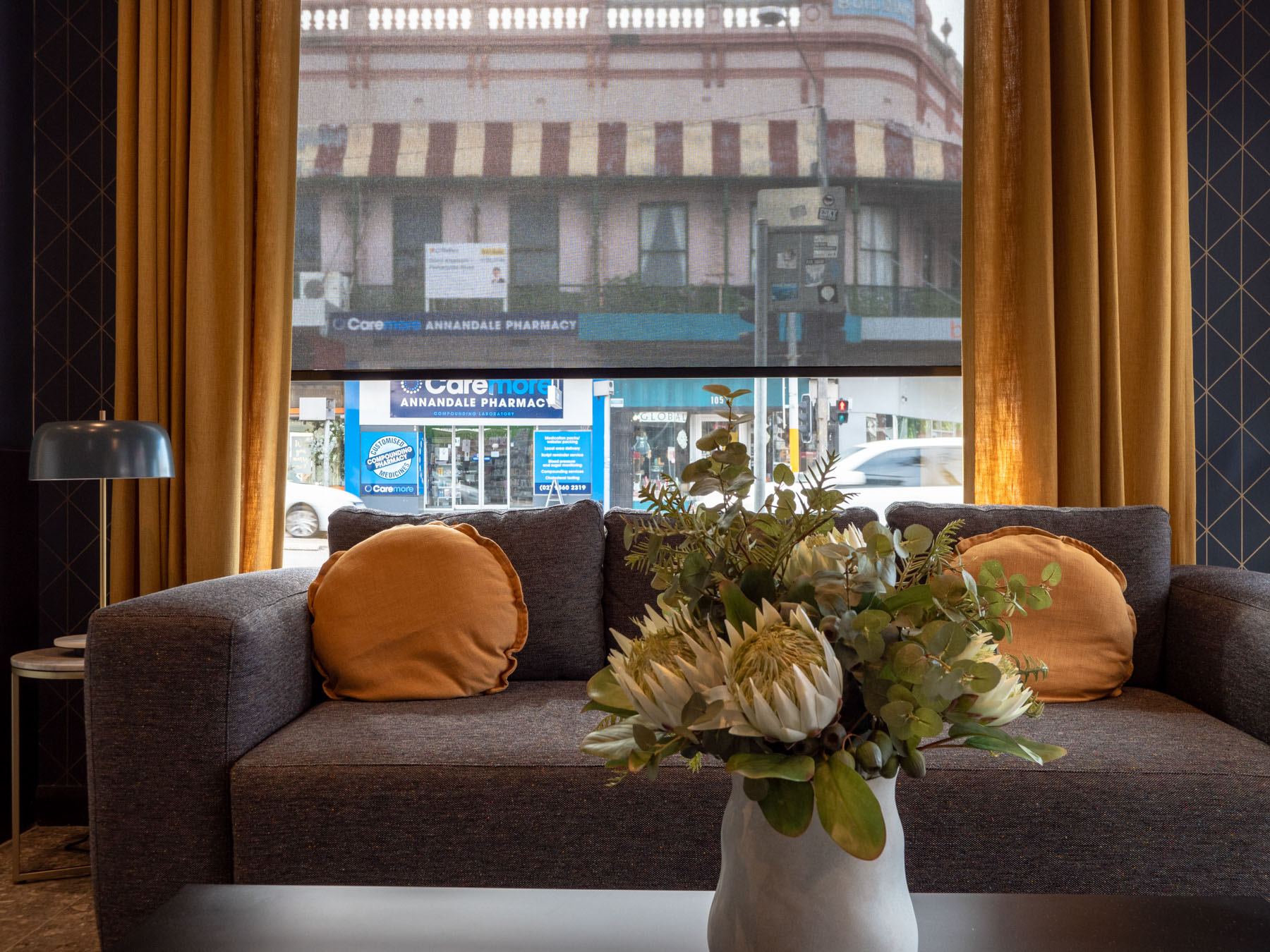
Another way to bring on even both colours into your home is through window coverings. Curtains are a wonderful way to incorporate colour as they show a hint while open, or a large expanse of colour, bringing a bit of drama into the room, when closed. Roman blinds are also a lovely way to bring in some colour to bedrooms especially.
Don’t be afraid
Regardless of how you choose to use the 2021 Pantone Colours of the Year, the message is pretty clear – stay grounded and reliable, but hope for a brighter, more exciting future.

