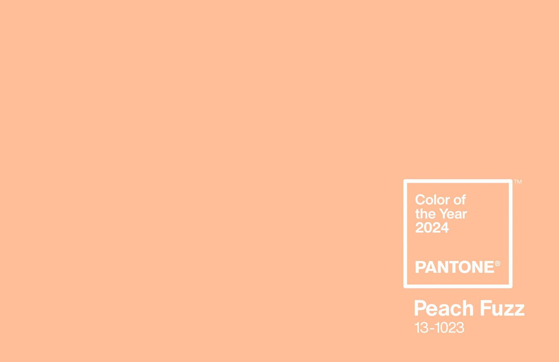
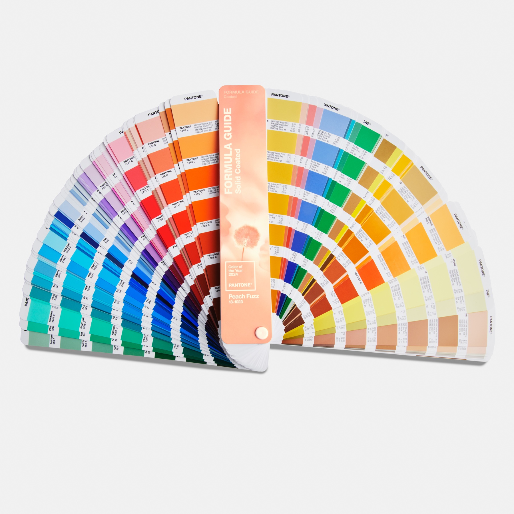
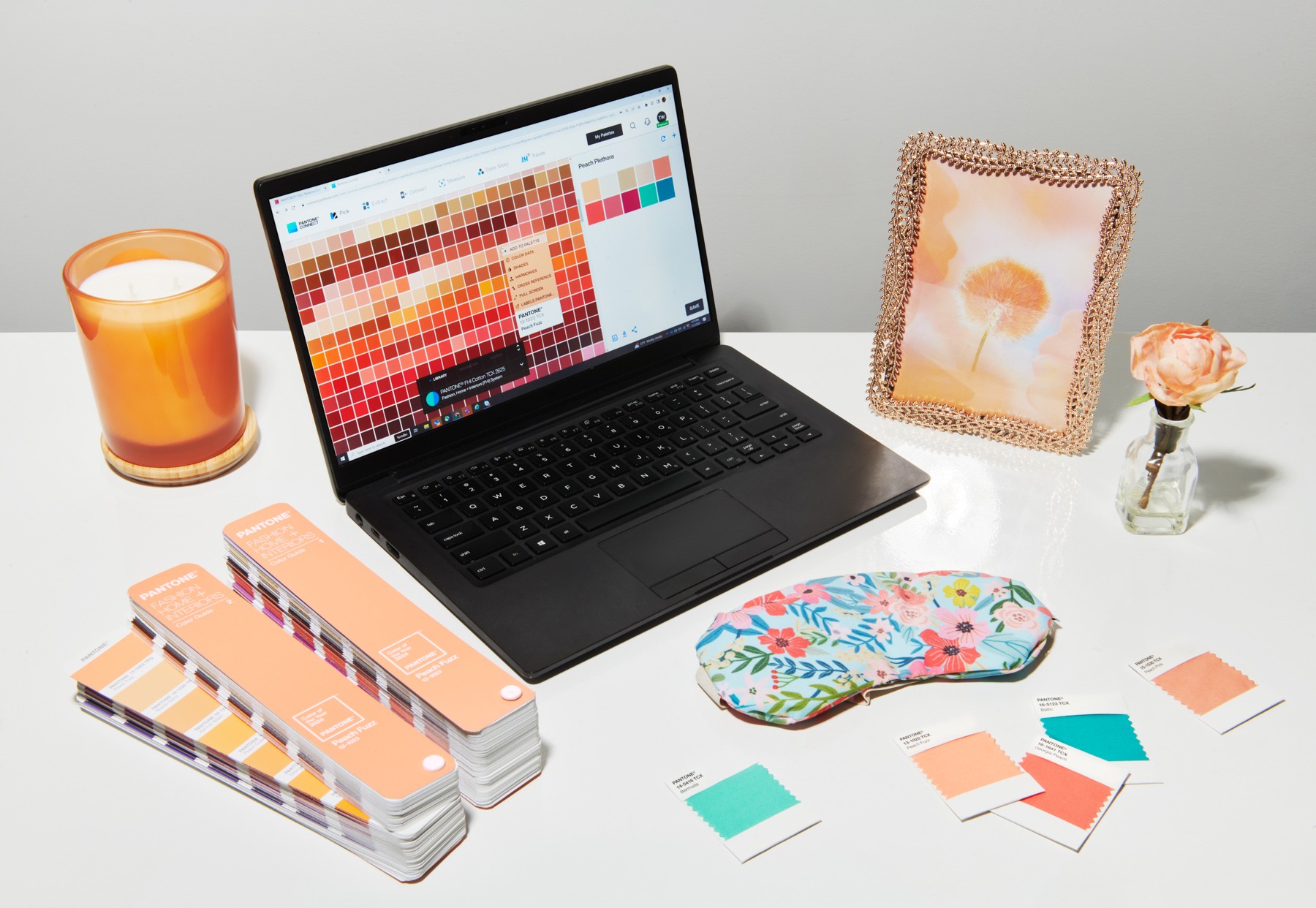
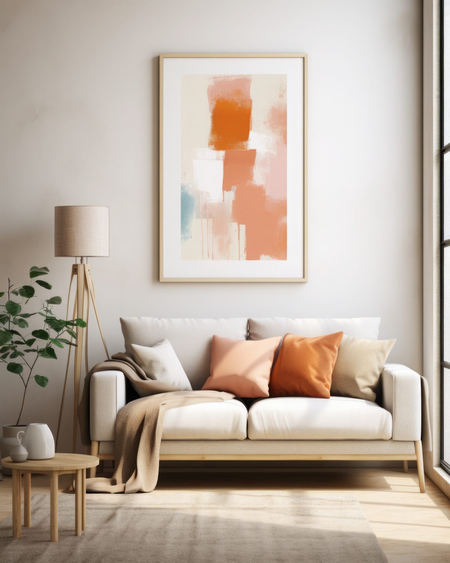
It’s that time of year – the announcement of the Pantone Colour of 2024. It’s all about warmth and connection with Peach Fuzz.
According to the Pantone story, Peach Fuzz is a velvety gentle peach tone whose all-embracing spirit enriches mind, body, and soul.
“In seeking a hue that echoes our innate yearning for closeness and connection, we chose a colour radiant with warmth and modern elegance,” executive director of the Pantone Colour Institute, Leatrice Eiseman said.
“[It’s] a shade that resonates with compassion, offers a tactile embrace, and effortlessly bridges the youthful with the timeless.”
The origins of Pantone Colour of the Year
It’s the 25th anniversary of the Colour of the Year. The first colour to receive this title was Cerulean Blue, so famously mentioned by Meryl Streep in her role as icy style maven and magazine editor in ‘The Devil Wears Prada.’
According to Laurie Pressman, vice president of the Pantone Colour Institute, the Colour of the Year started 25 years ago “to highlight to our audience how what is taking place in our global culture is expressed and reflected through the language of colour.”
Pressman recognised that since the first colour was chosen way back in 1999 – Cerulean Blue – the program has influenced product development and purchasing decisions in almost every industry, including fashion, cosmetics, packaging, commercial interiors and of course, home interiors.
So how does the team choose the Colour of the Year? Pressman explained that it’s not one isolated meeting at a specific time of the year.
Rather, she said, it is “one long, continuously flowing conversation among a group of colour-attuned people. Our Pantone Colour Institute team members come from a wide range of design, cultural, and geographical backgrounds. The commonality that brings them together is their expertise in colour and design, and their ability to see the world through the lens of colour.”
Pressman refers to them as “colour anthroplogists” saying that they have an “intuitive ability to connect all that is taking place in the world and translate it into the language of colour.” Cool job!
Let’s talk Peach Fuzz at home
Referred to as “subtly sensual”, Peach Fuzz is a heartfelt hue encouraging a feeling of kindness and tenderness, sharing and caring, community and collaboration.
Peach Fuzz is a great colour in that it works well with existing palettes, so it’s easy to incorporate into your home. It especially enhances the natural textures of timber, stone and plaster.
Perhaps the easiest way to incorporate Peach Fuzz is through soft furnishings. As a bonus, it also means you can change things up if you get the urge to.
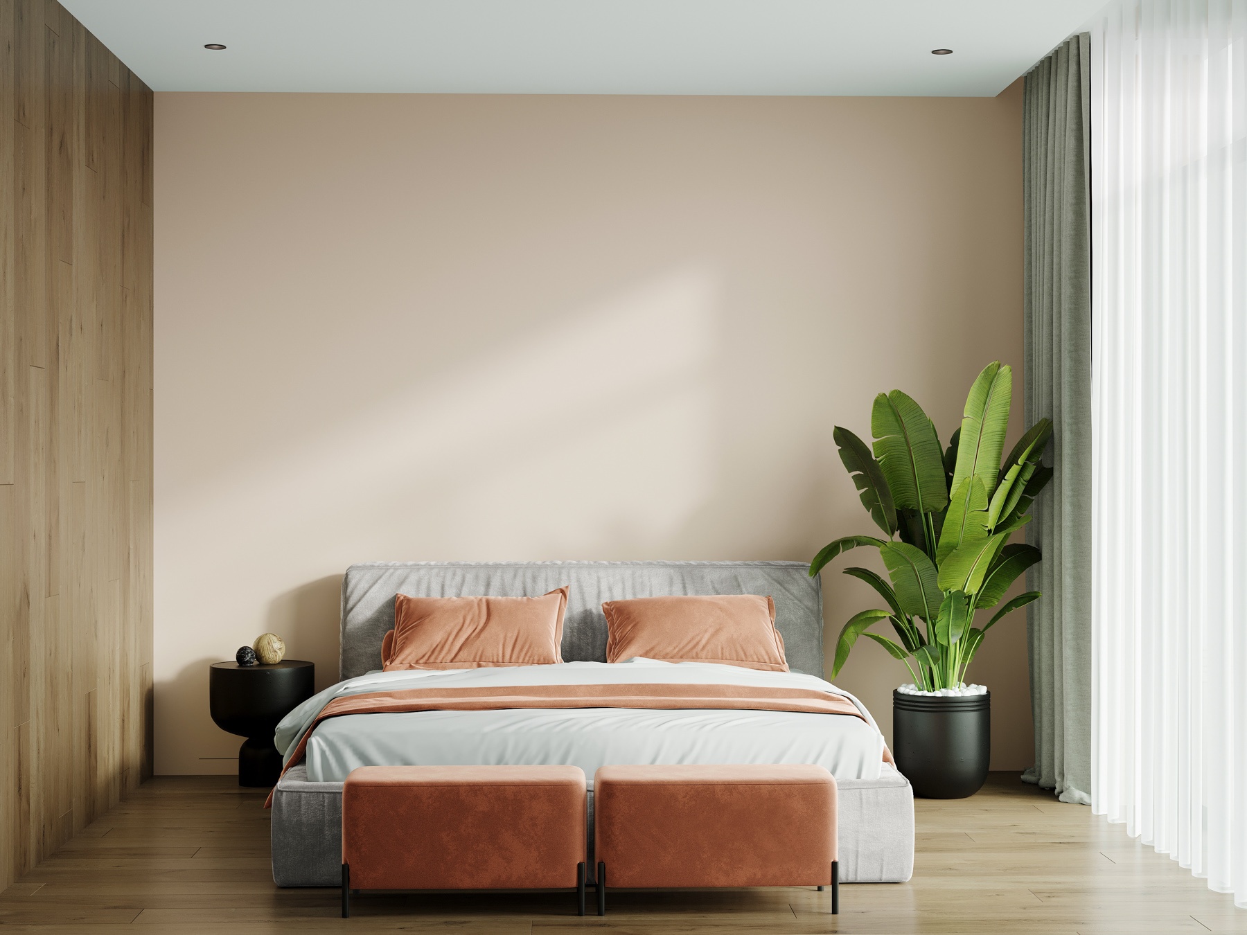
In the bedroom, there are plenty of linen options that will look beautiful on your bed, particularly timber beds as Peach Fuzz works seamlessly with timber.
Offset the warm tones of Peach Fuzz with linen window furnishings in neutral tones – grey, cream or sage, depending on your style choices.
In the living room, it looks lovely as a throw or cushions for the couch. Remember, it doesn’t need to be block coloured items. You can definitely find some gorgeous gingham patterns that include Peach Fuzz or grab something stripey. It makes more a more subtle inclusion.
You can even bring the colour into the bathroom with some Peach Fuzz coloured towels and bathmats.
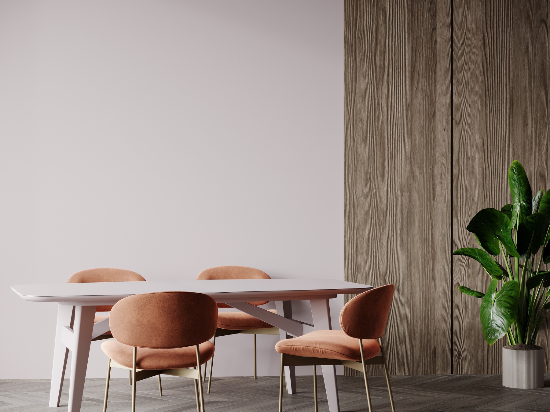
Peach Fuzz can be likened to a softer shade of terracotta so it can be absolutely gorgeous used in bolder ways around the house.
Dining chairs against a timber or stone dining table, a statement piece of furniture like an armchair, or even in veined marble kitchen benchtops.
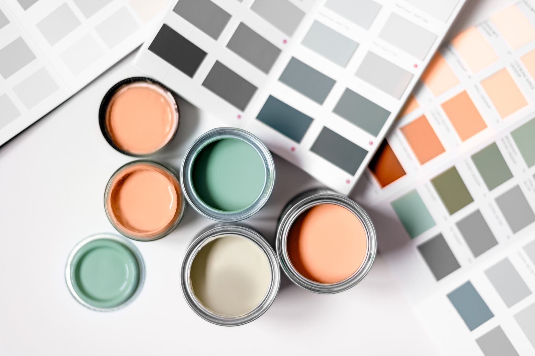
A feature wall in the living area is always worth considering – remember it doesn’t have to be just paint, it can be feature wallpaper, too.
Tiles can also be used in the bathroom or you can find beautiful stone sinks nowadays in a range of colours. Pair the tiles or sink with some classic bronze tapware and it will make for a spectacularly relaxing, warm bathroom – run the bath and chill out.
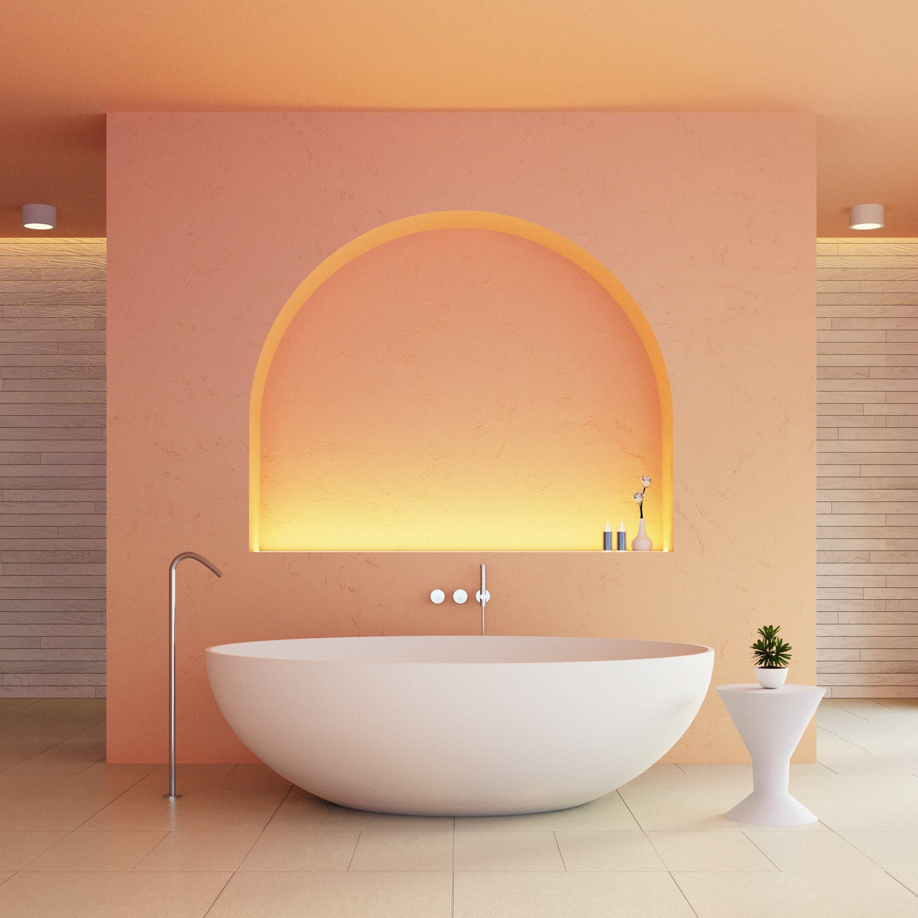
Embrace the warmth
Regardless of how you decorate using Peach Fuzz, it’s clear the Pantone Colour of the Year for 2024 inspires a sense of sanctuary and calmness, and as Pantone itself says “evokes a new modernity”.

