Pantone have been carefully selecting a colour of the year for more than 20 years, but this year it’s significantly different. It is the first colour of the year custom-created by Pantone.
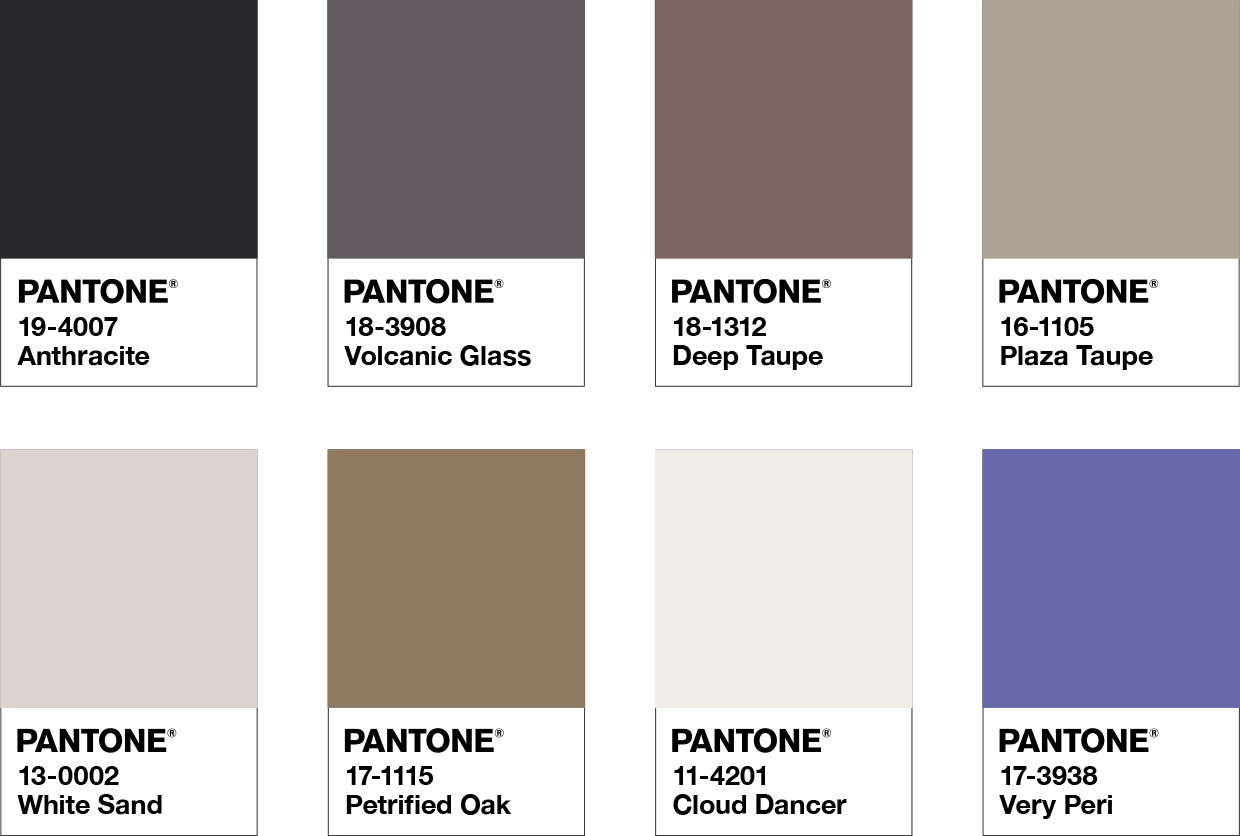
Very Peri is a periwinkle blue mixed with a violet red undertone. If it looks vaguely familiar to you, that’s because very similar shades have been around for a while – in the digital world.
Gaming, apps and soft-pop design all love purple and violet, and now we do IRL, too.
So six months into 2022, how is the colour holding up, and how can you use it at home?
Very Peri is a colour that will stay
Very Peri was inspired by the digital world, and by the innovation and transformation taking place as a response to the global pandemic. But it isn’t unfamiliar. It’s retro-futuristic. For this reason, it’s a trend that will stay around for a while.
“This color has been used in cyberspace and metaverse artwork on the covers of novels for decades. You look at William Gibson’s Neuromancer, for example, and you see they incorporate Very Peri,” said Tom Spota, head of motion at Adobe Stock.
Seriously kick-ass cover design from Editions Aleph, Brazil pic.twitter.com/zqcmcBR97X
— William Gibson (@GreatDismal) October 24, 2016
“I think it’s because it’s not a colour you often see in the natural world. It’s synthetic, artificial, but pleasant to look at,” he said.
Go soft furnishing crazy with Very Peri
If, like most, your walls, floors, cabinets or furniture are in neutral colours, then Very Peri is a fantastic colour addition for soft furnishings.
This palette of classics and neutrals convey a message of timeless sophistication.
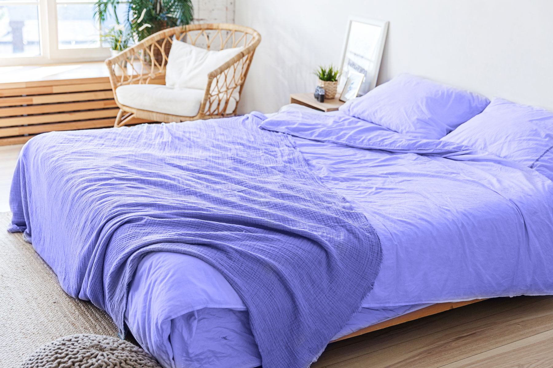
Grab a throw or some cushions for your couch, or even some lovely decorative pillows for your bed.
Very Peri can also look very striking as a rug in any room of the house, a bedspread to bring a pop of colour into your bedrooms or some artwork through the home.
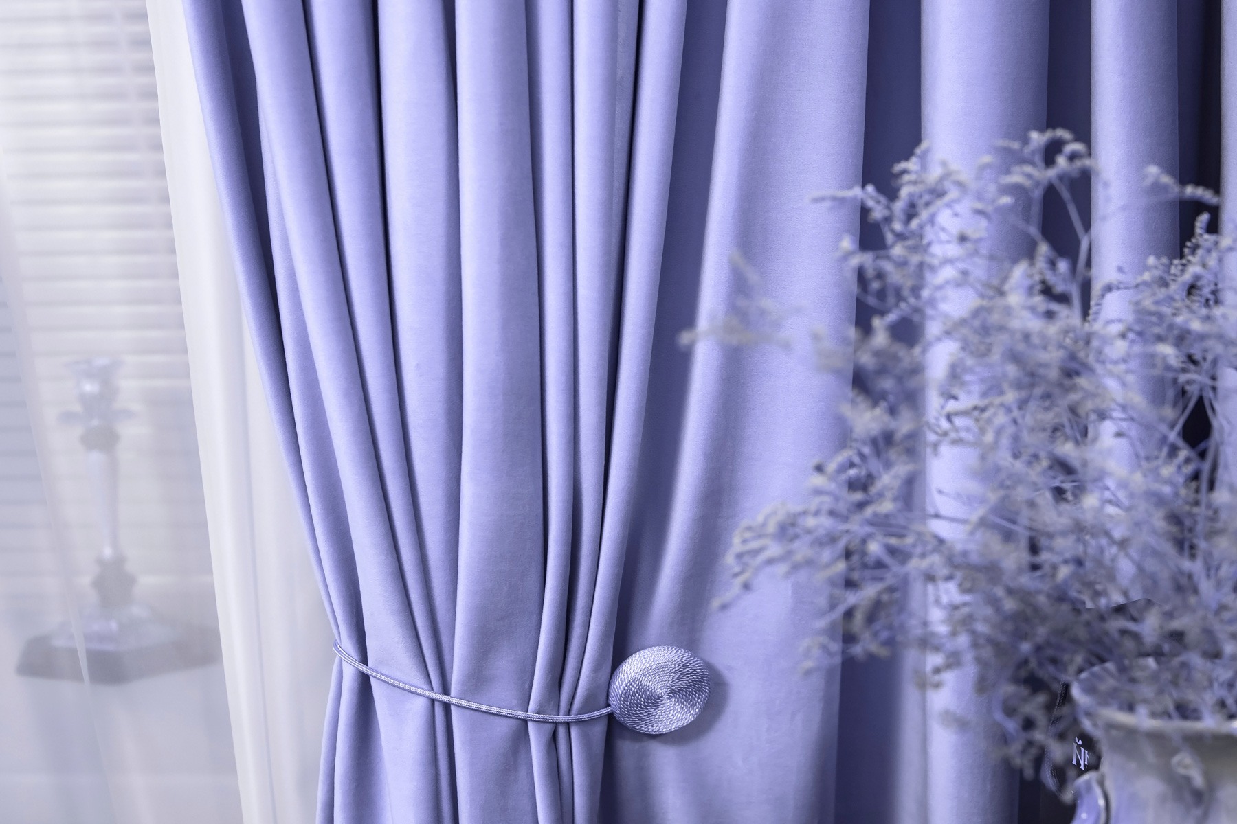
Very Peri curtains offer a hint of colour or a bold statement depending on the fabric and the placement.
Another way to bring Very Peri into your home is through your window coverings. Curtains give you the best of both worlds – a hint of the colour when open or a bold statement when closed, providing a touch of drama.
Feeling bold? Say it with a whole wall
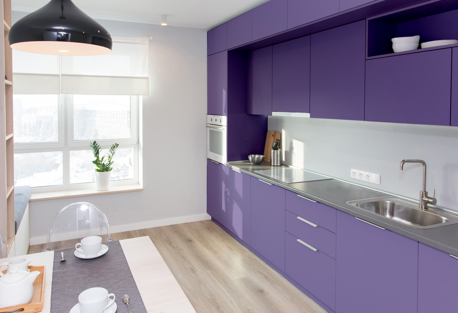
From doors to walls or even stair rises, there are plenty of spaces around your home that would look absolutely fantastic painted with Very Peri.
Make a bold statement with a whole wall – it can look wonderful in a bedroom – use it as a splashback in your kitchen, paint the back of some shelving or cabinets to make a statement.
Don’t be afraid. Remember, things can be repainted if you tire of the colour or if you feel it no longer suits your style.
Also, cool colours, including Very Peri, are calming, so you can use this hue in any room without creating too much stimulus.
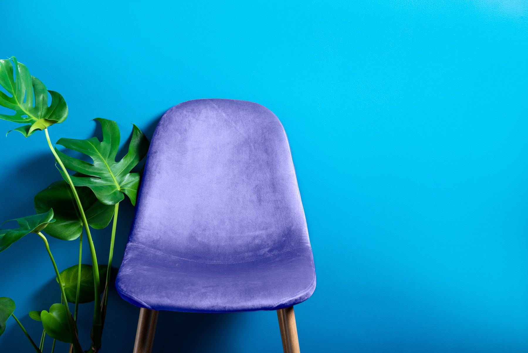
Statement furniture
As a colour, Very Peri suits almost every style of decor, from industrial to shabby chic and even farmhouse cottages.
When it comes to statement furniture, a gorgeous armchair can work in every room. You can also grab some Very Peri stools for the kitchen, dining chairs, even a Very Peri fabric headboard for a bedroom.
As Pantone says on the website, “Very Peri injects a sense of playful freshness into home interiors, enlivening a space through unusual colour combinations. A versatile shade that animates our creative spirit… Very Peri is suited to an array of different materials, textures, and finishes.”
They say fortune favours the bold, so if Very Peri makes you feel good – jump into the colour of 2022 without fear. We reckon it will be around for a while yet.
